Metadata details #
Defining metadata details is a way to enhance the user experience by improving the metadata management workflow on an asset or a device. There are multiple features you can use :
- Translation (mandatory)
- Group (optional)
- Editor hint (change UI elements) (optional)
Translations (mandatory) #
This property allows to add a localized user-friendly name and description to the metadata. Those will be automatically substitued according to the user's language.
Example
{
  metadataMappings: {
    company: { type: "keyword" },
  },
  metadataDetails: {
    locales: {
      en: {
        friendlyName: "Manufacturer",
        description: "The company that manufactured the plane",
      },
      fr: {
        friendlyName: "Fabricant",
        description: "L'entreprise qui a fabriqué l'avion",
      },
    },
  },
}
Group (optional) #
This property allows to group metadata together.
First, create a metadataGroups object at the same level as metadataDetails, using the group's name as a key and mapping them to their localization details. Then in the metadataDetails object, specify the group of the metadata by using the group property.
Example
{
  metadataMappings: {
    company: { type: "keyword" },
  },
  metadataDetails: {
    company: {
      group: "companyInfo",
    },
  },
  metadataGroups: {
    companyInfo: {
      locales: {
        en: {
          groupFriendlyName: "Company Information",
          description: "All company related informations",
        },
        fr: {
          groupFriendlyName: "Informations sur l'entreprise",
          description: "Toutes les informations relatives a l'entreprise",
        },
      },
    },
  },
}
Editor hint (optional) #
This property allows to specify the frontend whether it should display a custom widget to edit the metadata, like a dropdown of values, a clock picker or date picker with or without time, make a metadata read-only, and so on.
You have to set the enum type associated to the hint you want and fill the properties with your values.
This is the list of the available hints:
Read only #
The read-only feature allows to prevent users to edit a metadata.
Set to BASE if you only want the readOnly property.
The readOnly property can be set with other Enum type too.
Enum #
| Type | Value |
|---|---|
BASE | base |
Properties #
| Name | Type | Description | Optional |
|---|---|---|---|
readOnly | boolean | It displays or not the edit button | Yes |
Examples
// Typescript
{
  metadataMappings: {
    network: { type: "keyword" },
  },
  metadataDetails: {
    network: {
      editorHint: {
        type: EditorHintEnum.BASE,
        readOnly: true,
      },
    },
  },
},
// Javascript
{
metadataMappings: {
network: { type: "keyword" },
},
metadataDetails: {
network: {
editorHint: {
type: "base",
readOnly: true,
},
},
},
},Dropdown of values #
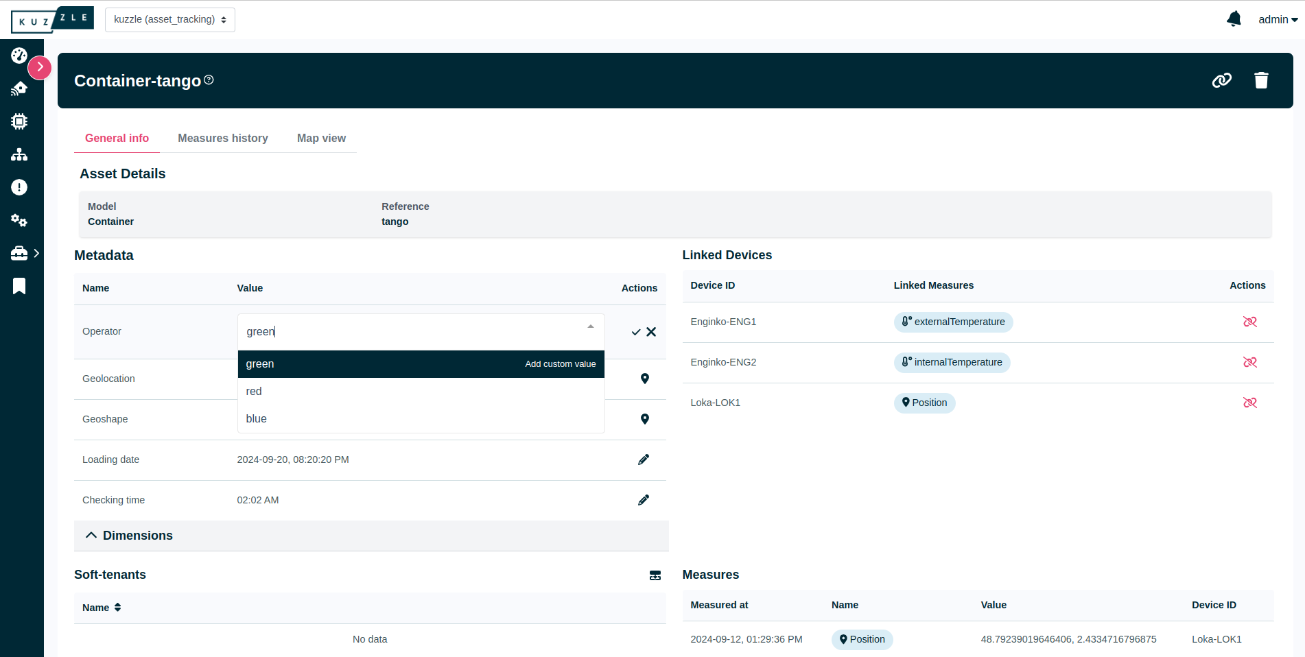
The dropdown feature allows to display a list of values to choose in a dropdown.
Enum #
| Type | Value |
|---|---|
OPTION_SELECTOR | optionSelector |
Properties #
| Name | Type | Description | Optional |
|---|---|---|---|
values | string[] number[] boolean[] | A list that represents all the values displayed in a dropdown. | No |
customValueAllowed | boolean | Allows users to add custom values. | Yes |
Example
// Typescript
{
  metadataMappings: {
    company: { type: "keyword" },
  },
  metadataDetails: {
    company: {
      editorHint: {
        type: EditorHintEnum.OPTION_SELECTOR,
        values: ["red", "blue"],
        customValueAllowed: true,
      },
    },
  },
},
// Javascript
{
metadataMappings: {
company: { type: "keyword" },
},
metadataDetails: {
company: {
editorHint: {
type: "optionSelector",
values: ["red", "blue"],
customValueAllowed: true,
},
},
},
},Visual

Date/Datetime/Clock picker #
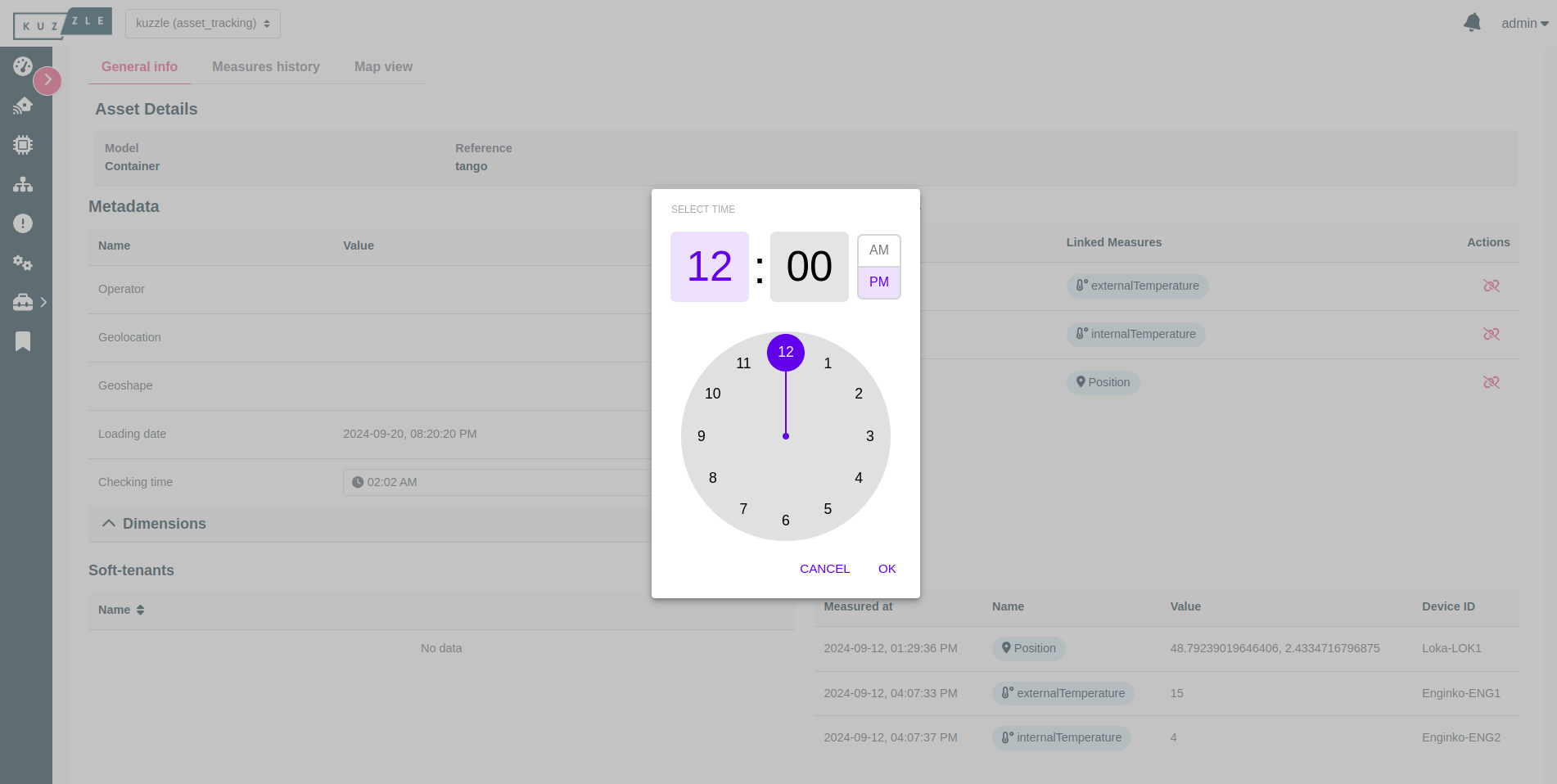
This feature allows to display either a date picker with or without a time picker, or a clock picker.
Enum #
| Type | Value |
|---|---|
DATETIME | datetime |
Properties #
| Name | Type | Description | Optional |
|---|---|---|---|
date | boolean | If true, displays a date picker, otherwise displays a clock picker. | No |
time | boolean | If date is true, setting this to true will add time picking to the date picker. | Yes |
Example
// Typescript
{
  metadataMappings: {
    date: { type: "date" },
  },
  metadataDetails: {
    date: {
      editorHint: {
        type: EditorHintEnum.DATETIME,
        date: true,
        time: true,
        customTimeZoneAllowed: true,
      },
    },
  },
},
// Javascript
{
metadataMappings: {
date: { type: "date" },
},
metadataDetails: {
date: {
editorHint: {
type: "datetime",
date: true,
time: true,
customTimeZoneAllowed: true,
},
},
},
},Visual
